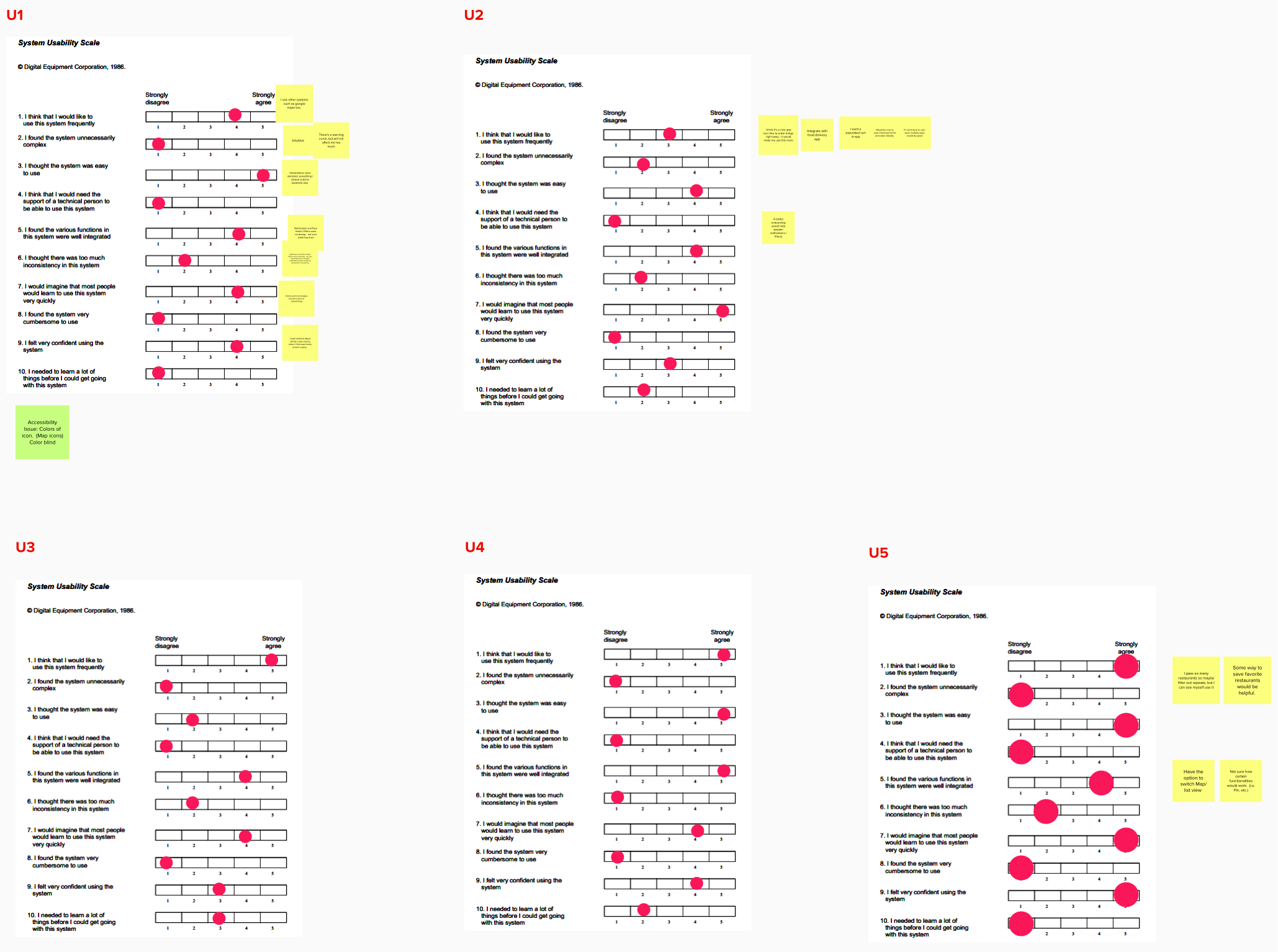
Problem Space
What can we help people discover nutritional information on the go?
Solution
A mobile app that helps vegans and vegetarians discover the food that satisfies their preferences.
Grove is a mobile app that combines familiar mapping features with clear iconography and a notification system that helps vegans and vegetarians discover the food that satisfies their preferences. Link to final protype here.
Timeframe
- August 2020 - December 2020
Team
- Gabriel Britain
- John Britti
- Phoebe Tan
- Wenrui Zhang
Tools
- User Interviews
- Affinity Mapping
- Journey Mapping
- Survey
- Figma
Tags
- UX Research
- Mobile Interface
Final Concepts
Grove is a mobile app that shows all nearby restaurants that have vegan and vegetarian options. "Options" is critical here, because Grove doesn’t exclude restaurants that aren’t explicitly vegan or vegetarian, and instead displays the composition of each restaurant’s menu, so users can be confident that they can get a decent meal even at places that aren’t exclusively catering to their dietary preference.
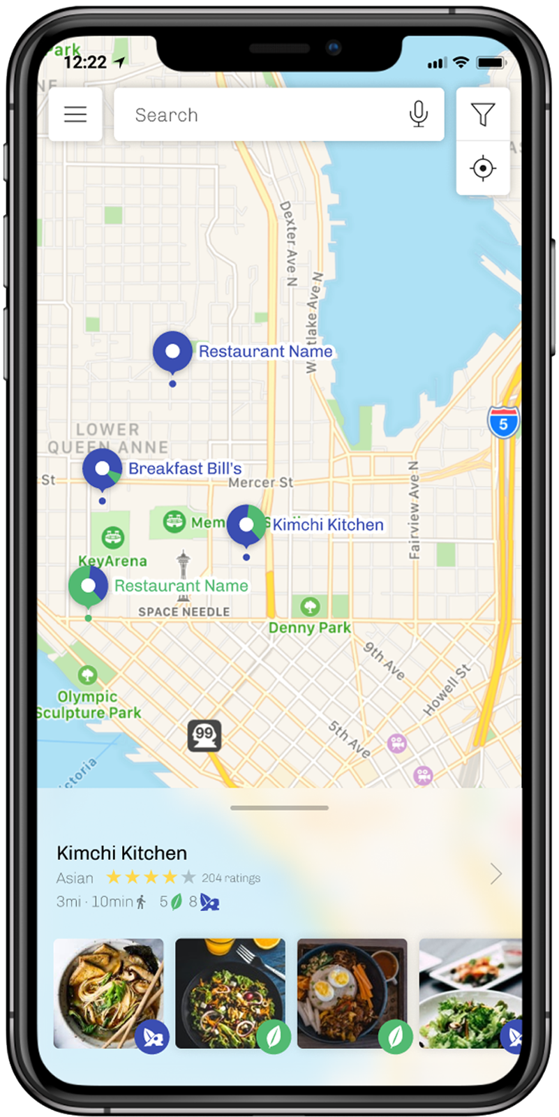
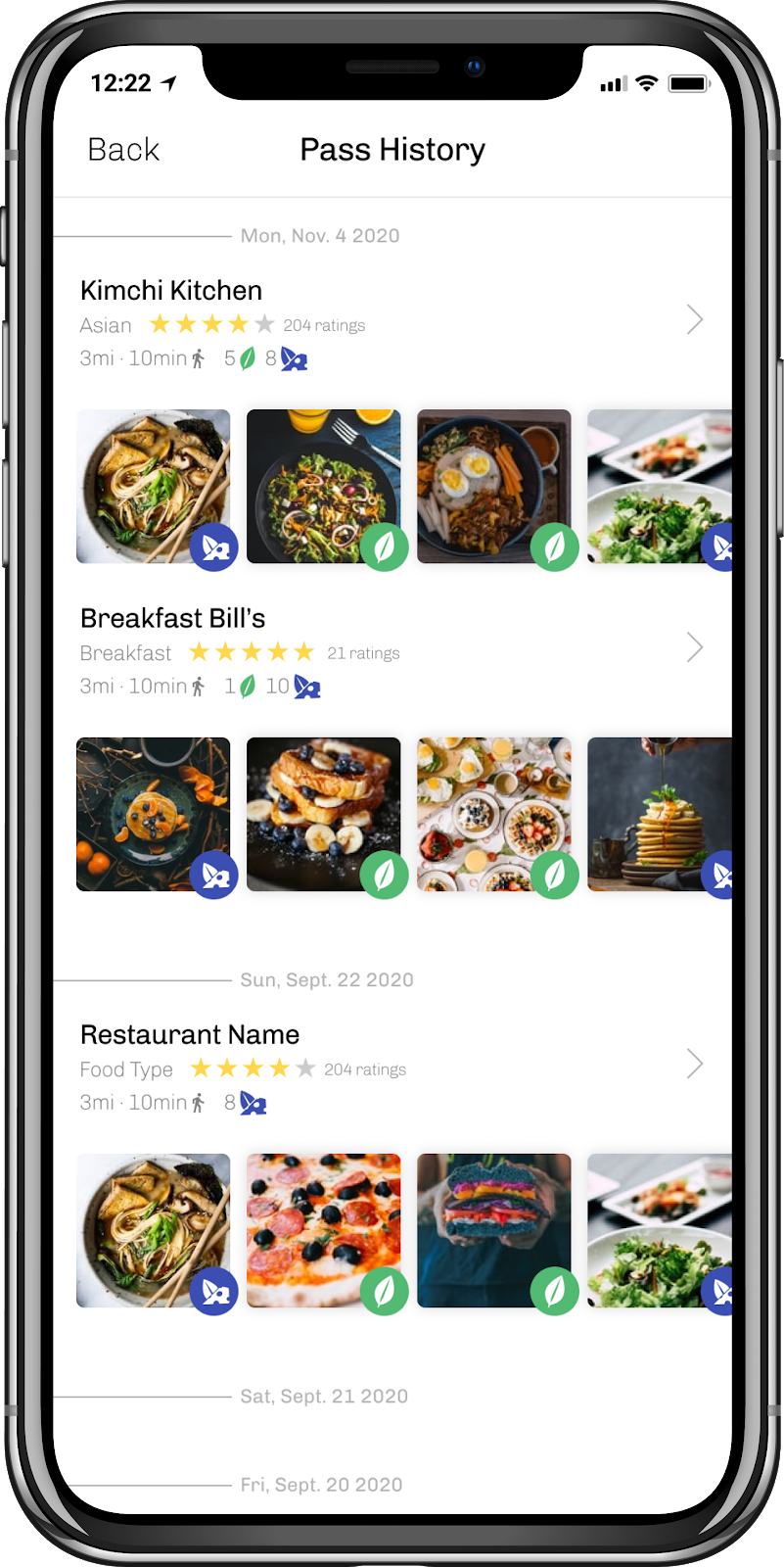
Grove is designed to be clean, yet information dense. Our research suggested that our users like to look at a restaurant's menu before ordering, often at pictures of the menu items themselves, so we placed as much of that information as close to the surface of the interface as possible without sacrificing readability, and provided users with robust filtering functionality. We also made menu legibility a priority, clearly denoting vegan or vegetarian dishes with distinct iconography.
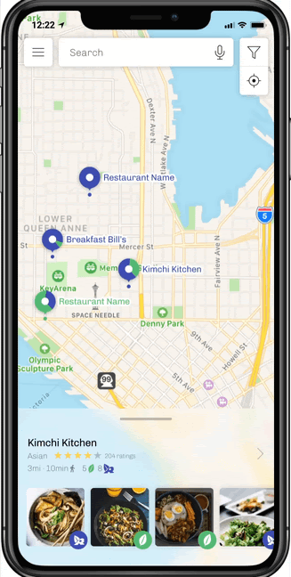
Finally, Grove has an automated newsletter system, providing our users notifications on the restaurants they've passed by on a weekly (customizable) basis, helping them expand their horizons.
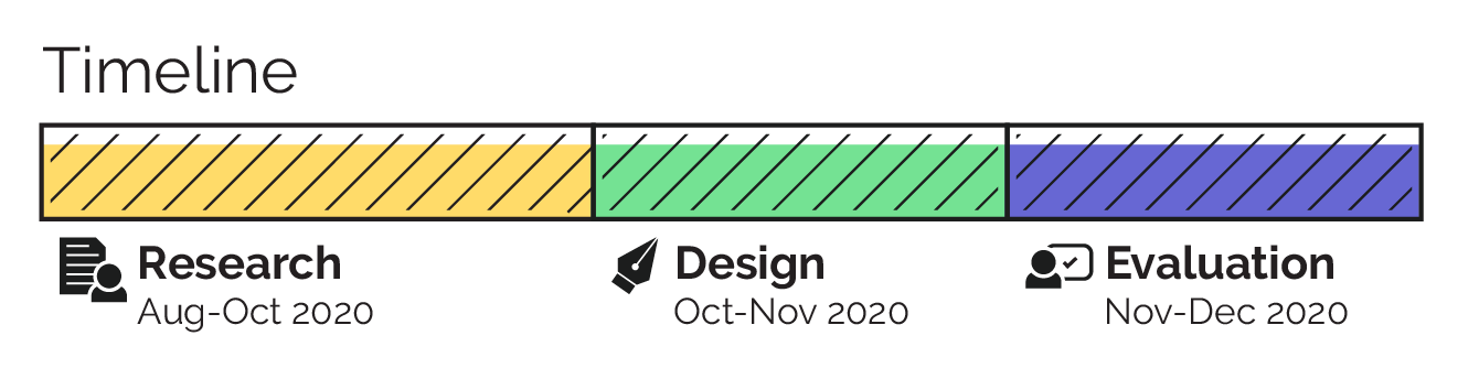
Timeline
This project was structured into roughly 3 stages: research, design, and evaluation, with a heavy emphasis on on research.
Problem Focus
This project began with a broad prompt: help people discover nutritional information on the go, but before we could begin designing, we needed to thoroughly define who we were trying to help and what needs of theirs weren't being met. We knew this meant we would need to restrict our scope from the initial problem statement.
"Nutrition on the go" was simply too broad a topic to adequately define a user population, so we explored different stakeholders and contexts where nutrition is an issue.
Ultimately we decided to focus our project on vegans and vegetarians, because people within our social circles and market research suggested that this kind of diet was growing, yet still had plenty of room for innovation.
Research
🔎 Discovery
Research Approach #1
Literature Review
Research Approach #2
Competitive Analysis
Research Approach #3
Interviews
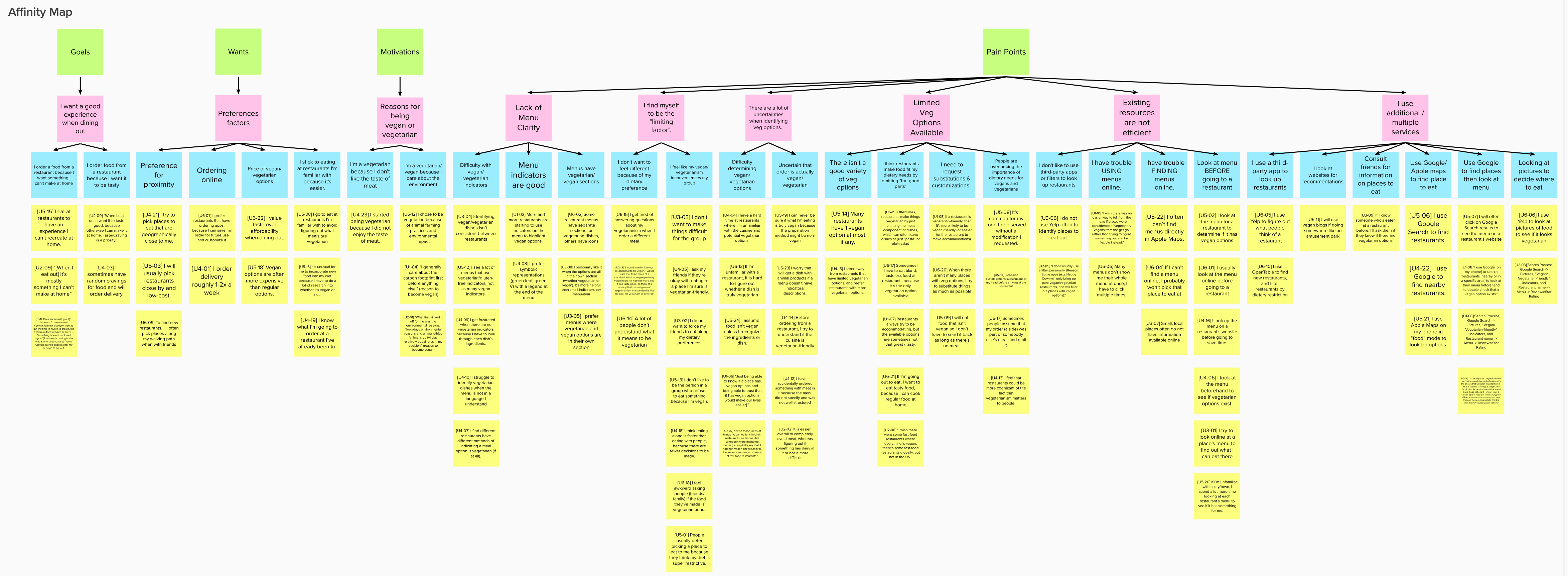
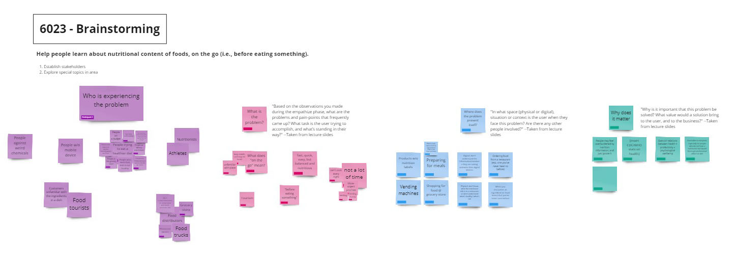
We then took all of our findings and organized them into user personas and a journey map, so we could give our problem space some structure. The former codified the desires, abilities, and backgrounds of our users so we could maintain a coherent image of who we were developing for, and the latter fleshed out every step in the process of eating out, from deciding where to eat to completing the order so we could clearly address every pain point.
📏 Refinement
With the journey map in hand, we conducted a second round of interviews, asking individuals in our target population to critique our distillation of their experience dining out.
While we were confident in our investigation of the problem space, we had yet to find a context specific enough to where we could begin the design process. There were simply too many pain points throughout the process to choose, so we conducted an online survey to let our users decide.
We deployed a Qualtrics survey to the r/vegan subreddit and various Georgia Tech social media venues to determine which of our pain points were felt the most by our users.
The results of the survey and the journey map critique suggested that our users experienced the most potent pain points during the discovery phase, so that's what we started to design for.
Design
Our design process was iterative, taking user and expert feedback at each step to refine our ideas until they could be realized as a medium fidelity prototype.
Sketches
After brainstorming ideas, we decided to move forward with 3. We developed simple storyboard sketches for each idea, and presented them to prospective users, asking them to identify aspects they liked, disliked, or thought could be developed more.
Wireframes
With the feedback from the sketch workshop, we iterated on each idea and created a rough wireframe for each, and performed a task-based analysis with users. Here we discovered more technical problems with our concepts, like confusion with visual elements and UI flow.
Prototype
Taking the best qualities from our wireframes, we went to Figma and began to develop a medium fidelity prototype. This is where I contributed most to this project, designing the app's visual identity, and developing most of its functionality.
Evaluation
Finally, we took prototype and subjected it to both usability testing with prospective users and heuristic evaluations with experts.