Problem Space
How can we leverage digital tools to make participatory design easier and more effective?
Solution
A digital whiteboarding toolset that helps users more easily engage with complicated whiteboard interfaces and helps researchers quickly collect data, organize it, and return to it later without losing context.
With the wider adoption of digital whiteboarding tools like Miro and FigJam, design researchers have the opportunity to reimagine the spaces where design takes place. No longer must designers and researchers keep their design work cloistered away from their users; the digital whiteboard can allow everyone to engage together and immerse themselves in data.
Our team worked with professional design practitioners both in industry and academia to imagine a whiteboarding toolset that could help bring about this new paradigm of digital participatory design.
These tools help design researchers better engage with participants during sessions and immerse themselves in the resulting data.
Timeframe
- August 2021 - May 2022
Team
- John Britti
- Sean Perryman
- Wenrui Zhang
Tools
- User Interviews
- Observation
- Journey Mapping
- Figma
Tags
- Participatory Design
- Whiteboarding
- Professional Productivity
- Figma
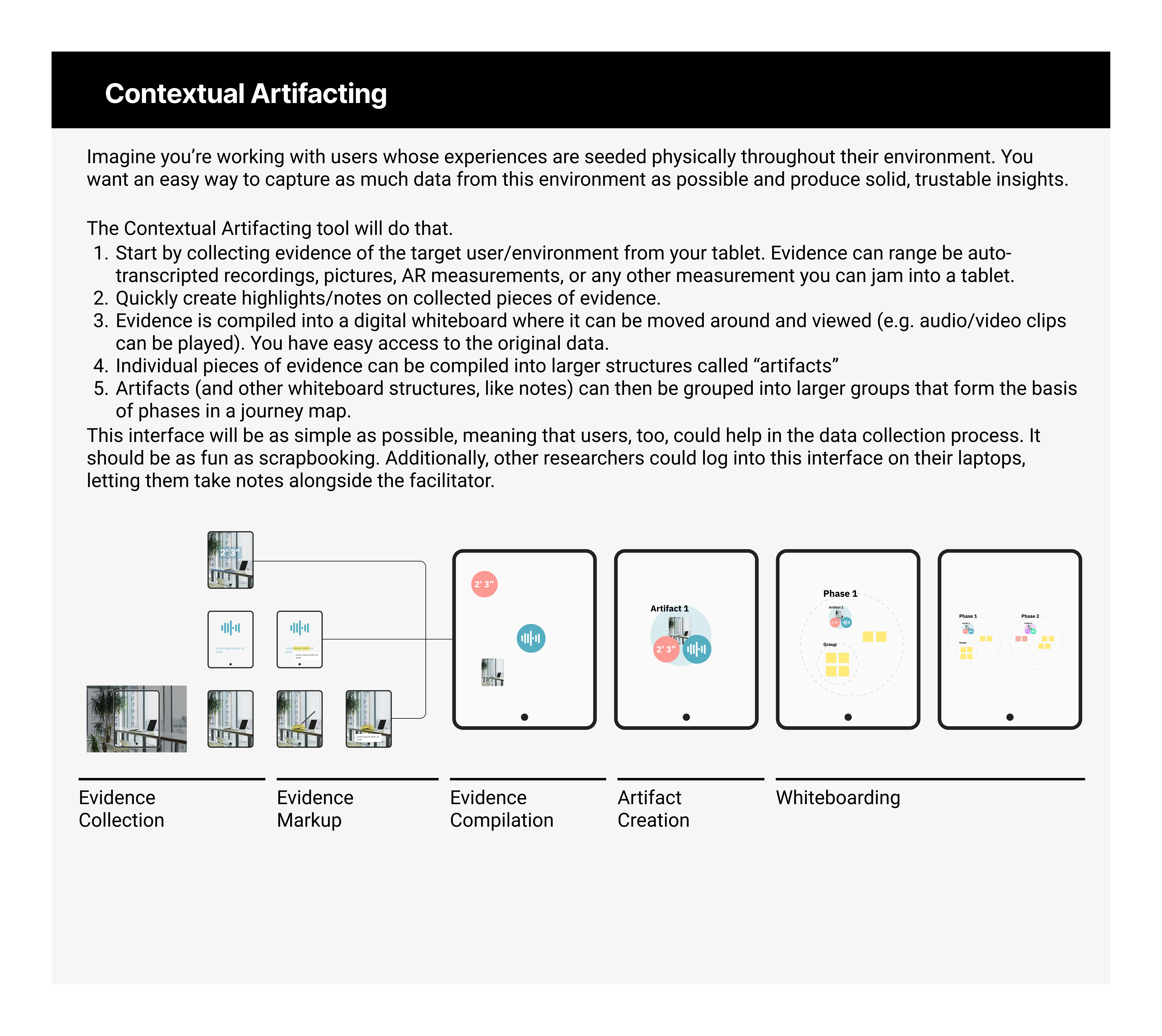
The Toolset
Here are the final prototypes for our whiteboarding toolset imagined in the context of Miro. You can view an interactive version here.
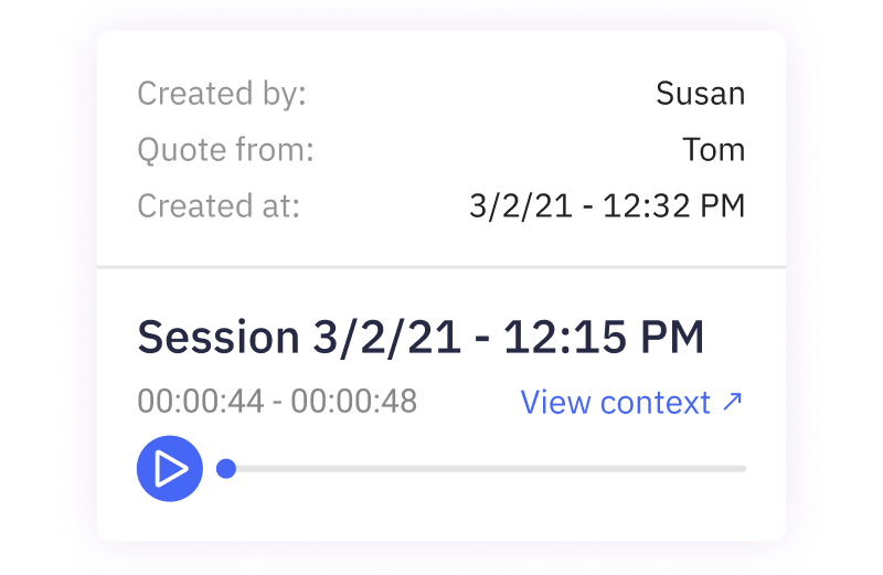
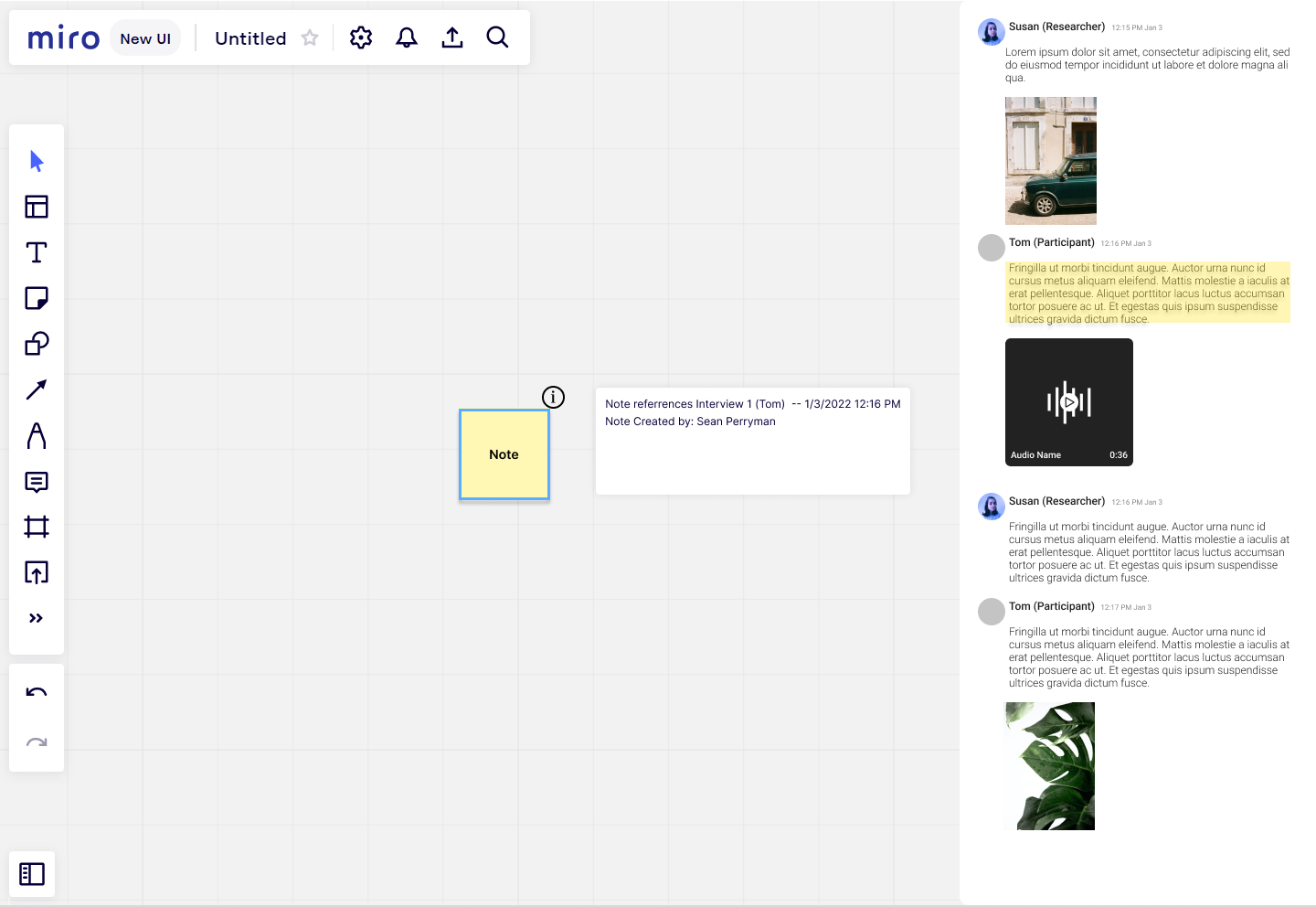
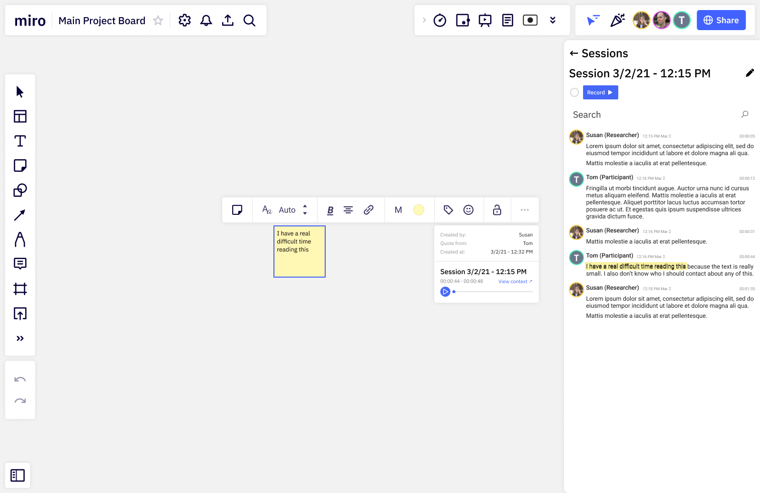
Evidence Collection Pipeline

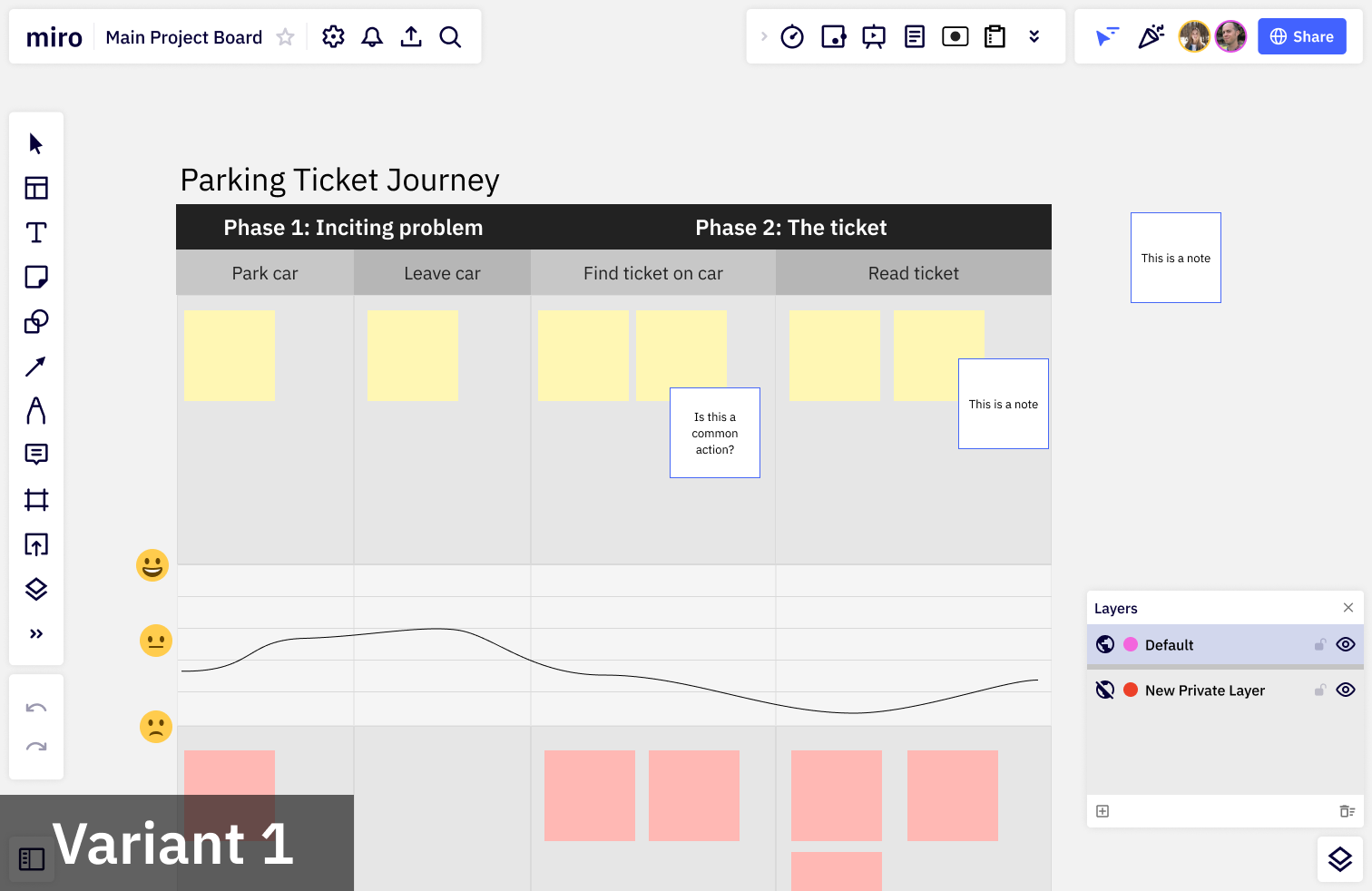
Layers


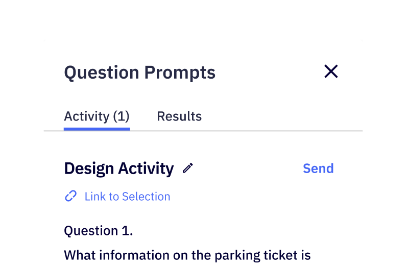
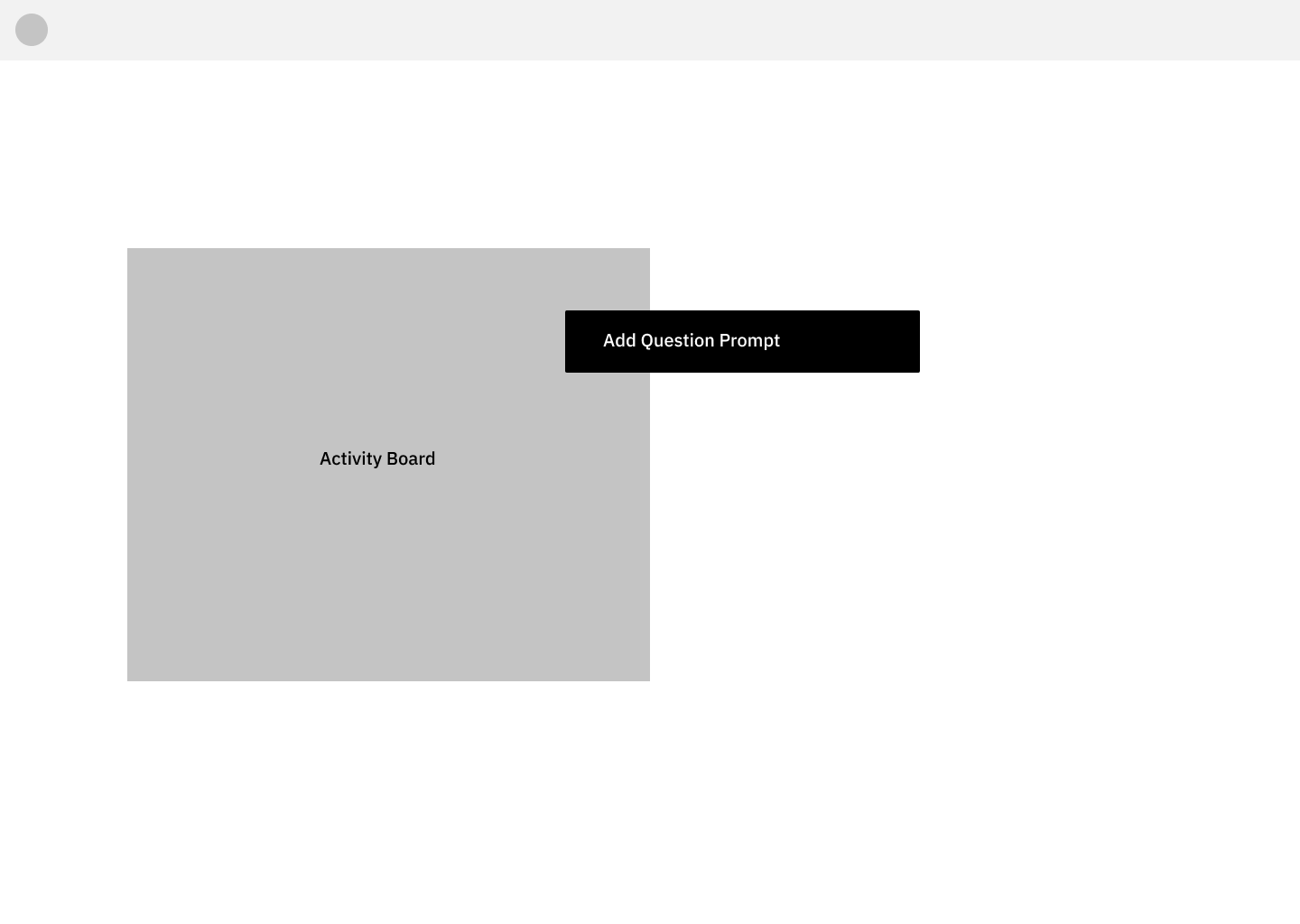
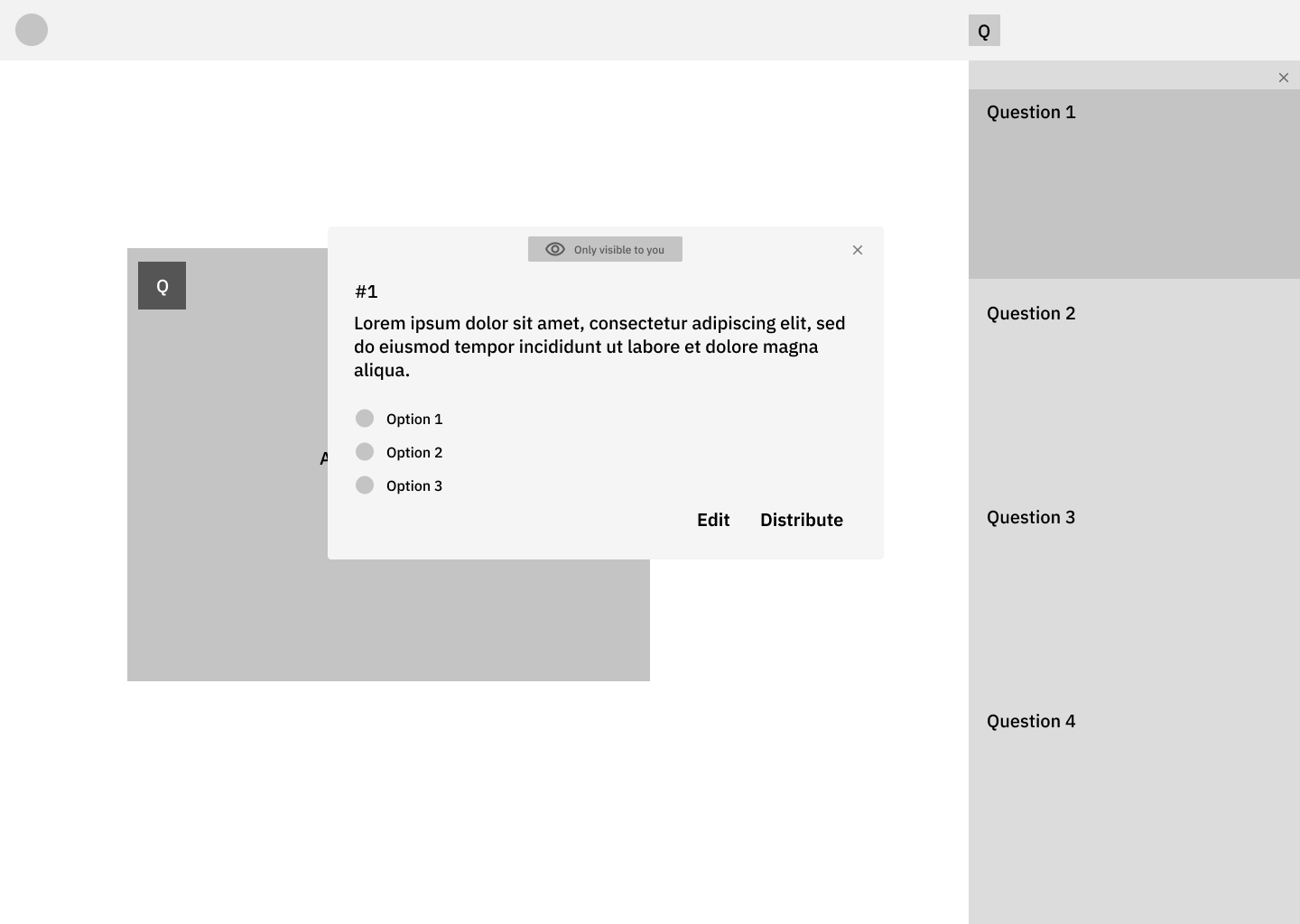
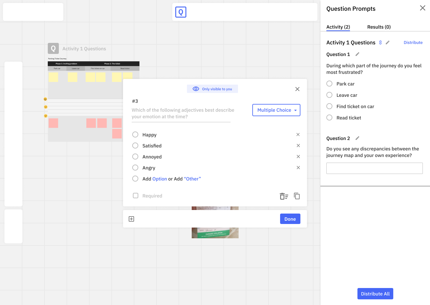
Question Prompts

Timeline
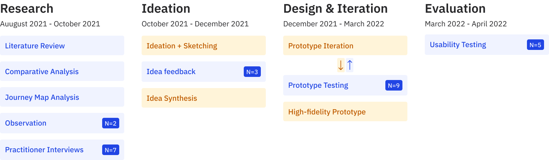
This project largely followed a standard double diamond design process with a more lean UX cadence during the ideation phase.
Research
Because our problem space was more speculative than reactive—that is, our goal was to imagine new approaches to participatory design, not directly address some specific point of failure—we conducted a mixed-method research approach designed to both identify the challenges of participatory design and collect novel approaches to participatory design that we could bring into our ideation.
We gathered a whole heap of insights, so I'll only share a few from each method to show what kind of results we were getting.
📚 Literature Review
To get a grasp on participatory design, we consulted academic papers for both information on its general nature and novel methods that academic practitioners deployed in the field.
Literature Review Insight #1
Designing With
Literature Review Insight #2
Transcription
Literature Review Insight #3
Layered Elaboration
⚖️ Comparative Analysis
In addition to reviewing academic sources, we also aggregated and analyzed several professional research and design tools to discover what features are currently being offered and what gaps still remain.
Comparative Analysis Insight #1
Expectations
Comparative Analysis Insight #2
Integration
Comparative Analysis Insight #3
Opportunity for Journey Management
👁️ Observation N=2
We had the opportunity to shadow professional design researchers at NCR while they performed participatory journey mapping with customers.
While we all had some experience running participatory methods from our classes, this gave us a look at how these methods work in the real world.
Observation Insight #1
Trouble Keeping Up
Observation Insight #2
Structures in Digital Whiteboards Can Be Difficult to Edit
Observation Insight #3
Aggregation is Onerous
Observation Insight #4
Participants Wouldn't Engage with the Board
💬 Semi-Structured Interviews N=7
The most fruitful research endeavor we pursued, however, were 7 semi-structured interviews with UX practitioners. 5 of which were peers at Georgia Tech and 2 of which were colleagues at NCR.
Each interview lasted roughly an hour, and we asked each participant to bring (or reference, if they no longer had access) a design artifact they co-developed with participants.
Semi-Structured Interviews Insight #1
Confirming Other Research
Semi-Structured Interviews Insight #2
Taking All the Notes
Semi-Structured Interviews Insight #3
Writing in the Margins
Semi-Structured Interviews Insight #4
Results are Very Messy
Semi-Structured Interviews Insight #5
Data Structures on the Fly
Semi-Structured Interviews Insight #6
Assigning Tasks
🗺️ Participatory Design Journey
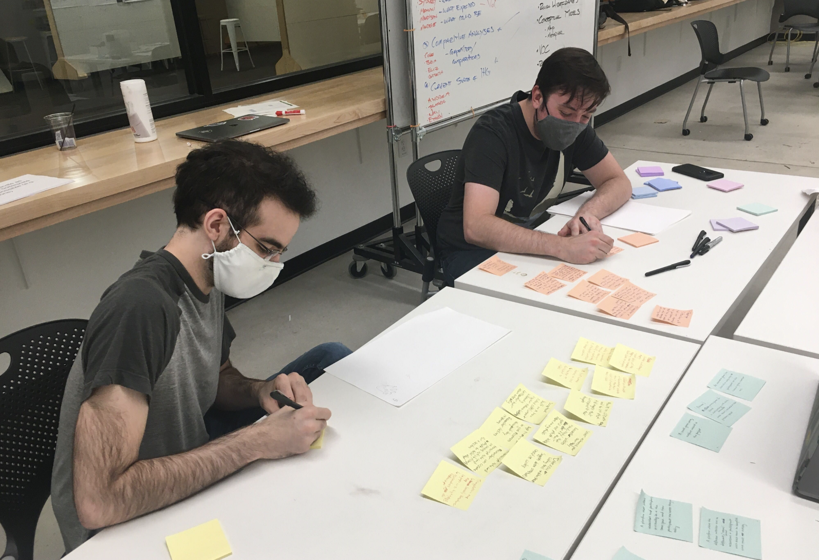
While we had individually organized all of our data, we wanted to summarize together as much of it as possible so we could most effectively contrast individual insights and identify where we could best intervene. To do so we constructed a large journey map, which I’ve summarized here, to identify where the most fertile soil was for a design intervention
Given the prevalence of problems throughout the design research journey we knew we would have to focus in on a smaller chunk, or else we'd spread ourselves too thin.
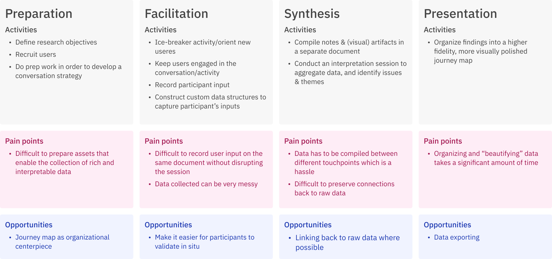
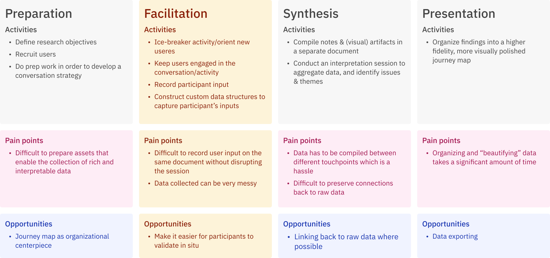
All of these phases had good enough evidence to support design work, but we ultimately chose the facilitation phase because it seemed to have the most pressing pain points and most opportunities for intervention; however, we wouldn't be strict if our ideas spilled into preparation or synthesis stages.
🗂️ Design Requirements
With our focus chosen, we generated design requirements to guide our idea generation.
Design Requirement #1
The System Should...
Design Requirement #2
The System Should...
Design Requirement #3
The System Should...
Design Requirement #4
The System Should...
Ideation
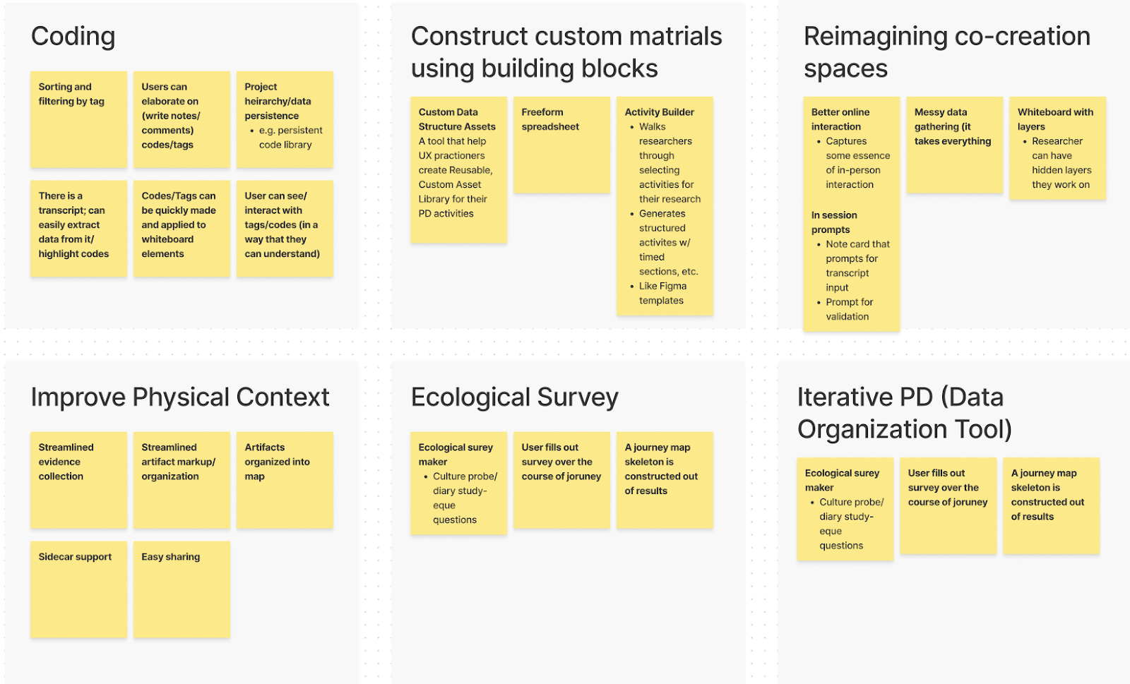
At this stage, we focused on generating as many ideas as possible based on user needs and design requirements. First, we timed ourselves to generate ideas on our own. Then we swapped our “idea cards” and built on top of each other’s ideas.
While going through all of the initial ideas, we found that there were some recurring themes, so we grouped the ideas that could fit well together into broader categories, identified key features that would best address user needs, and consolidated them into six design concepts.
✏️ Sketching & Feedback N=3
With our 6 ideas, we sketched them out and gave them brief descriptions. We then recruited two peers from the HCI program and scheduled 45min feedback sessions where we asked them to identify positives, negatives, and opportunities with each idea.
📦 Concept Reconfiguration
The results of these sessions showed that no singular idea was perfect, and we ended up using the feedback from this method to take apart each idea and repackage certain features as a more limited toolset.
Idea #1
Breakout Boards
Idea #2
Evidence Collection
Idea #3
Layers
Idea #4
Question Prompts
Design
With our new set of ideas in hand, we began designing wireframes for testing. Rather than building out prototypes over a longer period of time, then having isolated testing periods, we adopted a more lean UX approach where we tested each prototype weekly, regardless of where it was in development. This process afforded us two distinct benefits:
- We were able to respond to participant feedback immediately and make larger conceptual pivots while the prototypes were still "hot."
- We we able to elicit a gradient of feedback for our prototypes from more conceptual when they were lower fidelity to usability when they became high fidelity.
🔄 Lean UX Process N=9
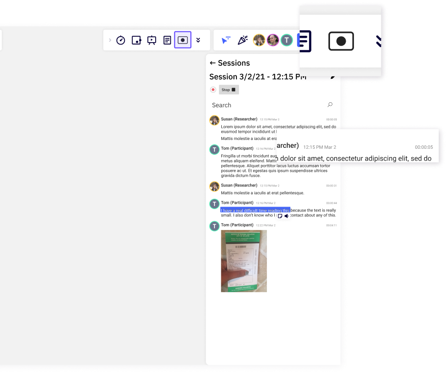
Every week for a month we scheduled 2-3 30 minute feedback sessions with UX practitioners (7 in industry and 2 MSHCI students). During these short sessions we had participants evaluate a subset of our tools by interacting with them on Figma and sharing their thoughts aloud as they did so.
Early prototypes were little more than concept wireframes with accompanying descriptions and barely any interactions.
At this stage we mainly gathered concept feedback, asking participants if they saw value in the idea, to recall (or imagine) situations where an idea would have been helpful, and to provide feedback on how the idea could be further realized.
Results from early on lead to larger swings in development. For instance, early feedback suggested that breakout boards while potentially helpful in certain circumstances, was too niche a problem and too slight a solution to warrant continued development.
As the ideas developed, the prototypes became more elaborate with multiple interaction flows and the feedback we sought became more focused on granular details and usability.
You'll notice in the images that we're relying more on a fake parking ticket scenario to give our users some context as they interact with the prototype.
Evaluation
After a month of prototyping with users, we took 2 more weeks to re-review feedback and prepare "final" prototypes that could be evaluated by our peers.
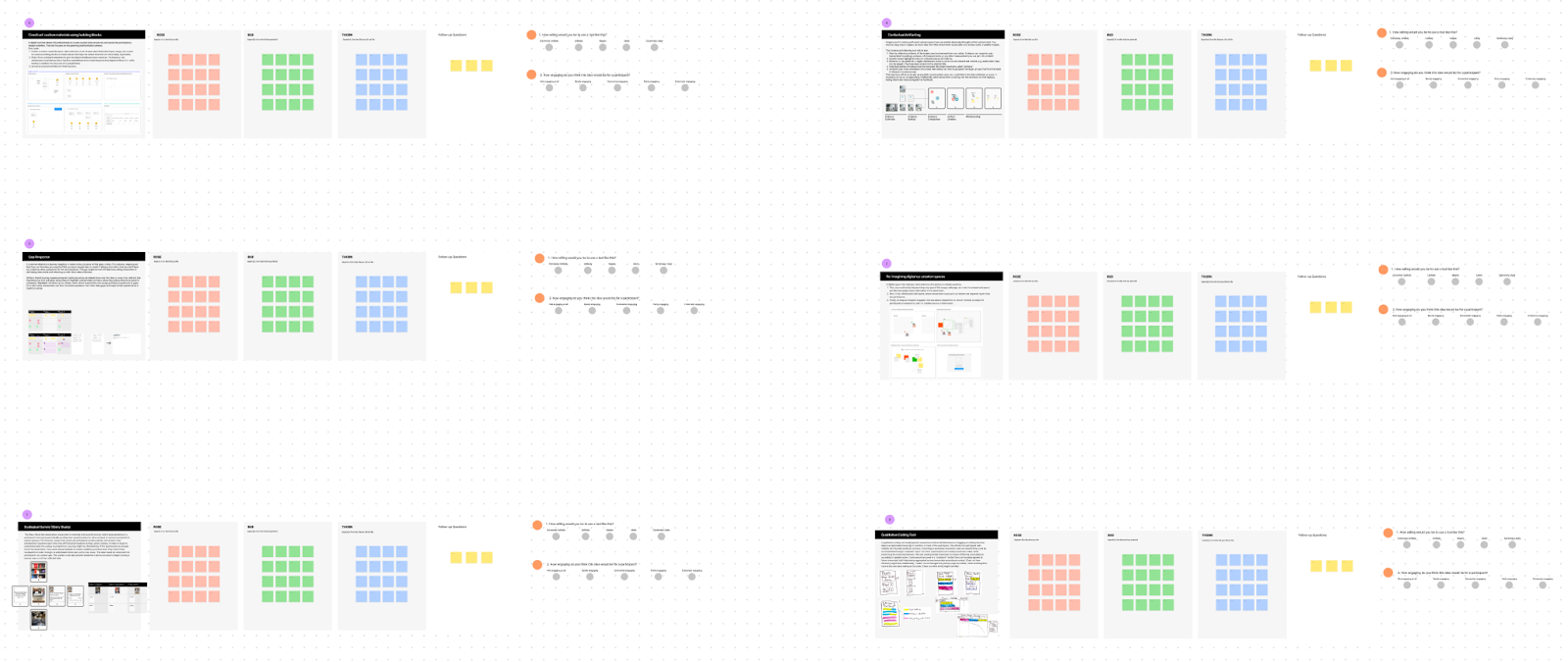
📋 Task-based Usability Evaluation N=5
To evaluate overall usability we conducted task-based assessments for each of our features, using a think-aloud protocol, with five of our peers in the MS-HCI program. We also included in our evaluations an A/B test for our layers feature to assess visual design variations for communicating note privacy and layer position.
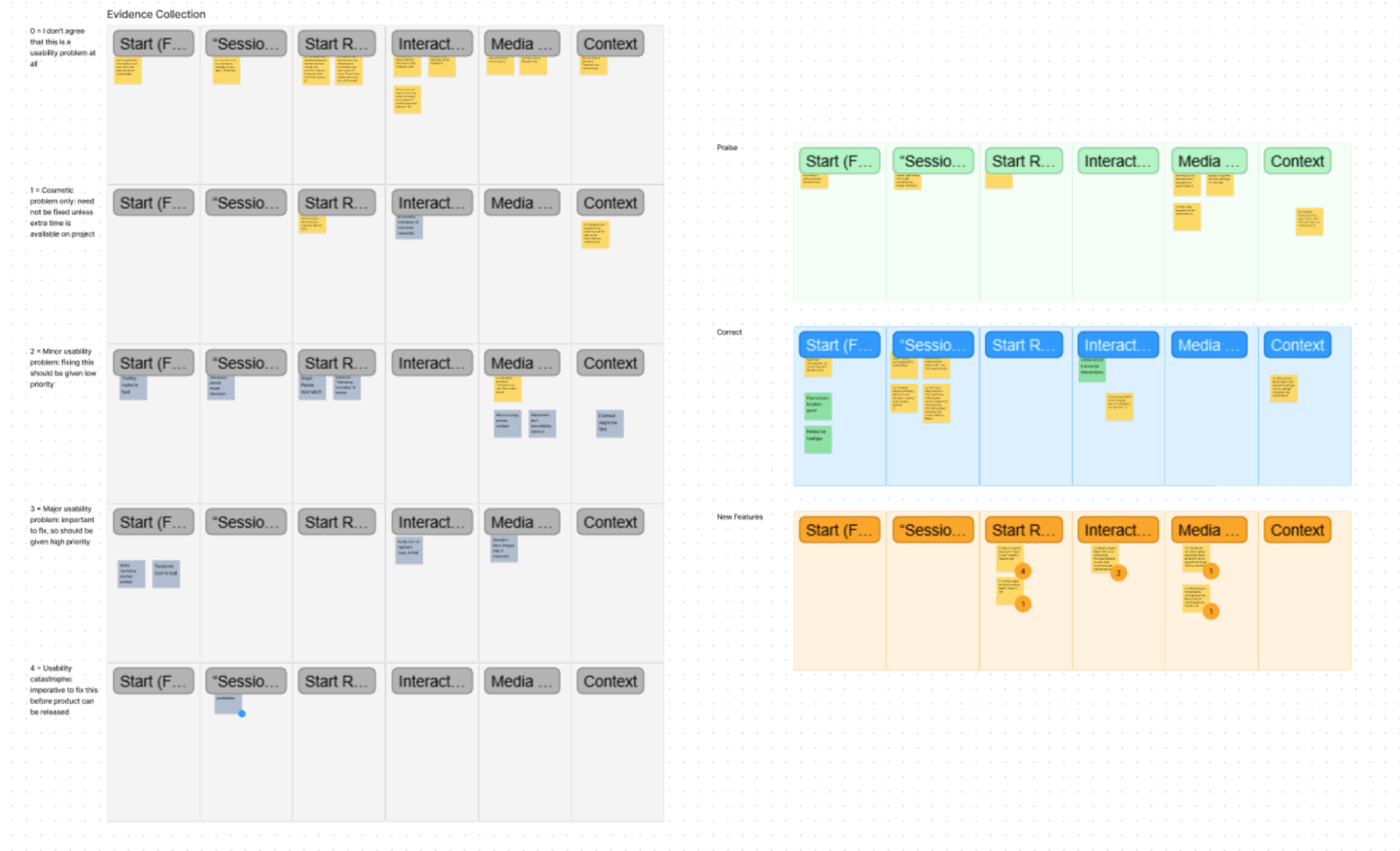
We organized the results in Figjam according to feature and flow, and rated notes according to severity from 0-4. Severity ratings were assigned by team members and determined based on considerations such as the centrality of an identified problem to the overall functionality of the system, how many users identified a given problem, and the feasibility of solving the problem.
Overall impressions were positive, with participants expressing enthusiasm towards the ideas, but of course, there were still issues that needed addressing. In the interest of brevity, I'll just describe some of the more severe problems we identified in Evidence Collection. Here you you can see that users had problems identifying icons at a glance and several participants noted readability issues with our text.
💌 Responding to Feedback
We had some time before our final presentation, so we decided to respond to some of the feedback we received. We couldn't get to everything, but using our results, we triaged the more pernicious issues and a few lower priority "quick wins."
These changes can be seen in the demo videos and interactive prototype here.
Conclusion
📏 Limitations
My greatest regret and likely the biggest limitation in this project is that we never constructed a fully functional prototype that we could test in a more realistic setting. While our prototype robustly captures the UI flow of each concept and adequately demonstrates what our toolset does, it doesn’t let us evaluate how it actually changes the process of a participatory design session and indeed if it does improve anything.
We may have received positive feedback about the concepts and even had participants imagining concrete situations where the features would be helpful, but these data aren’t full confirmation.
🚀 Future Directions
I believe that there's much more work to be done here. My dream for the future participatory design is one where the barriers between UX professionals and the users they're trying to help are as low as possible.
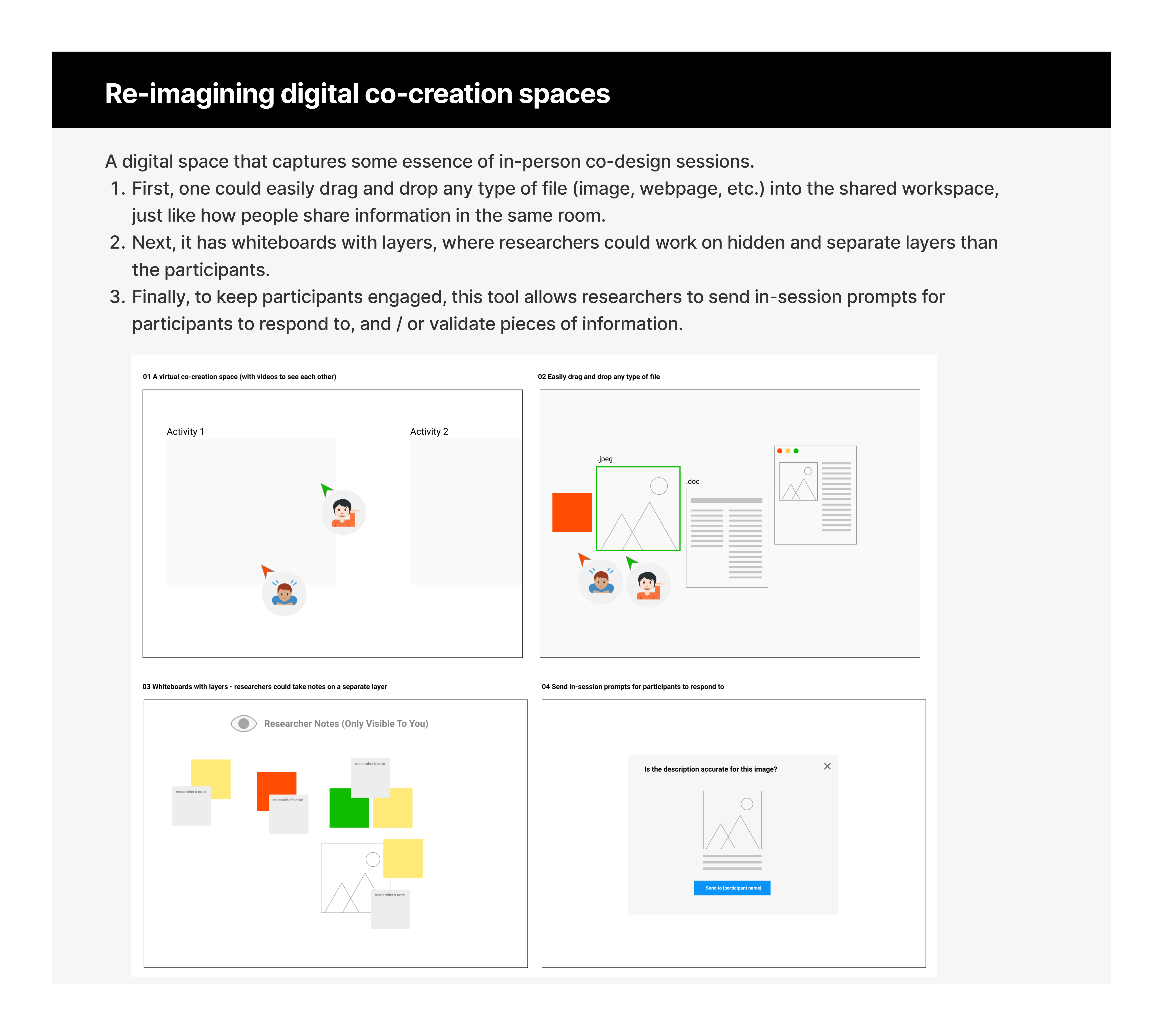
Much like a physical room where design and design research occur, these digital tools are providing designers with a means of collaborating in a shared space, of bringing end-users into participatory design practices, of housing various design artifacts in a single, persisting place. As work increasingly becomes physically disbursed and remote, these tools allow design work to occur across greater distances.
They also improve the access of end-users to design spaces by removing physical barriers and making participation more convenient. I view this “design room” metaphor for whiteboarding tools as being rich in design opportunities for expanding the functionality of these spaces.