Problem Space
What can social media apps do to help small to medium sized businesses (SMBs) in ways that aren’t advertising?
Solution
The COVID pandemic spurred many changes in the business world, most specifically, a marked shift towards using digital services for operations and customer interaction. Small to medium sized businesses (SMBs) were already going digital, and this was only accelerated. Indeed, according to Deloitte 77% of SMBs started or increased usage of digital tools during the pandemic.
Recognizing this shift as an opportunity, a client asked my partner and I to research how we might improve social media sites for SMBs to help them adapt. A stipulation from our client, however, was that our solution couldn't be advertising-based; he works at Facebook's advertising research division, so he wanted something novel.
Using WhatsApp as a base my team explored opportunities to improve the lives of SMBs in India and developed user-tested low fidelity prototypes designed to streamline customer interactions and organize business data, while retaining the familiarity of our user’s workflow.
Timeframe
- January 2021 - May 2021
Team
- Aditi Bhatnagar
- John Britti
Tools
- User Interviews
- Affinity Mapping
- Journey Mapping
- Survey
- Balsamiq
Tags
- UX Research
- Social Media
- Mobile Interface
- Balsamiq
Final Concepts
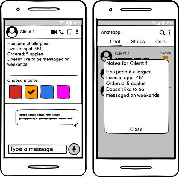
Contact Annotation
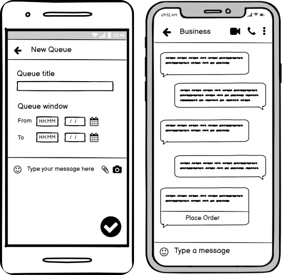
Queue
Timeline
Over the three month timeline of this project my partner and I used an augmented double diamond approach to the UX research process. Our only change was a third, smaller diamond at the beginning of the project where we narrowed down our prompt to something more manageable.
Problem Focus
Like many student projects, the prompt my team was initially given was incredibly broad; there are countless social media sites offering different forms of engagement and there are an even greater number of small to medium sized businesses offering just about every kind of good or service imaginable.
So, the teams first line of business was to reduce the scope down to something that was manageable and critically, actionable. That meant identifying a social media context and user population we were interested in.
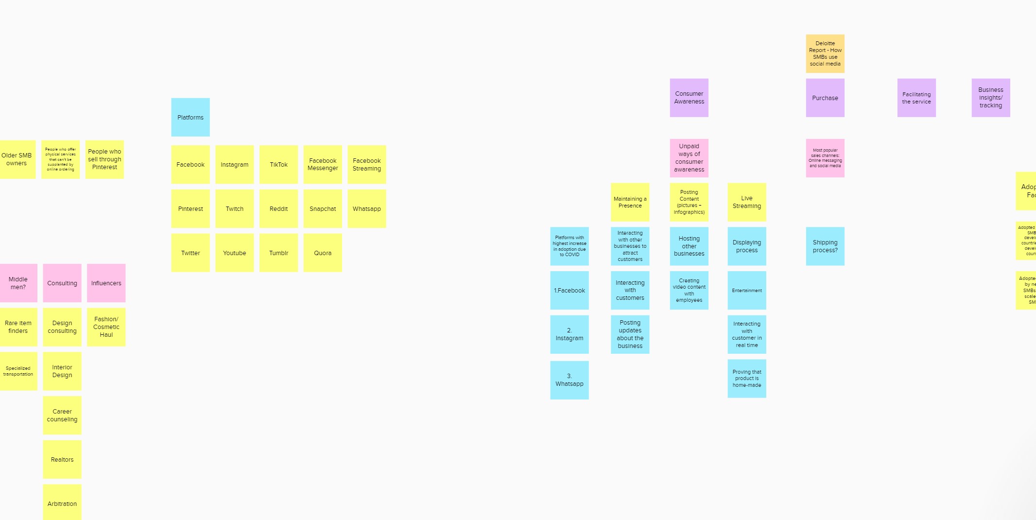
Leveraging our connections and a variety of literature sources, we identified several potential user populations and social media contexts ripe for a design intervention. We ranked these options by interest, feasibility, and population access then pitched the top two to our client to get his preference. Thus, we refined or problem statement to:
SMBs in India need a way to optimize WhatsApp for engaging with customers and stakeholders as their business continues to grow.
Research
🔎 Research Questions
Research Question #1
Research Question #2
Research Question #3
To structure our research, we developed these 3 research questions which we could come to answer throughout our research process.
💬 Semi-structured Interviews N=8
To start we conducted 2 rounds of interviews with SMBs from a variety of business contexts: Caterers, Tutors, Photographers, Fashion Designers.
In the first round, with 4 participants, we attempted to understand why SMBs use Whatsapp as their primary business communication tool and what problems WhatsApp had that we could solve.
In the second round, also with 4 participants, we wanted to elicit more contextual information and deepen specific insights.
After each interview, notes were aggregated and then affinity mapped to find common themes.
Interview Insight #1
Juggling a variety of touchpoints
Interview Insight #2
Users balk at complex business tools
Interview Insight #3
SMB owners like the ubiquity of WhatsApp
Interview Insight #4
Users leverage small networks available to them
Interview Insight #5
Our users leverage personal connections
Research Question #1
🗺️ Problem Mapping
Since our interview population represented a variety of businesses, we wanted to refine our problem space further. To do so, we mapped out all our problems into a grid, hoping to identify either a particular set of problems that affected most businesses equally or a particular business type that experienced most problems.
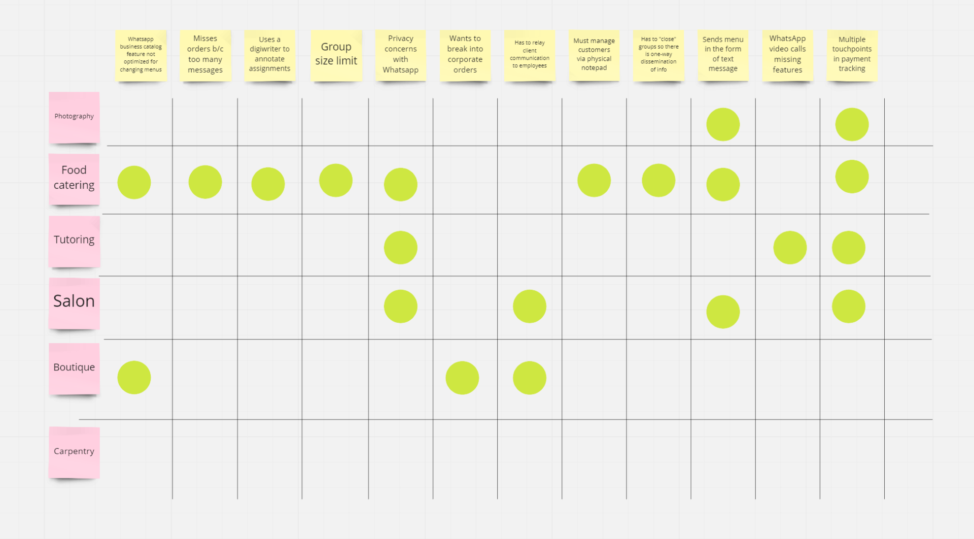
Given these results, we focused our problem statement in again:
SMBs in India need support from Whatsapp in easily creating and sharing menus and managing orders.
While there were several problems that users experienced across different businesses like privacy concerns with WhatsApp now that Facebook had changed its privacy policy or having multiple physical touchpoints, there were consistent enough themes with goods caterers that we felt confident pursuing this population further.
Research Question #2
💬 Contextual Interviews N=6
With our focus narrowed in further, we conducted more contextual interviews, focused on gaining a greater insight into the moment to moment activities goods caterers perform and pain points they experience. In addition to asking our users questions directly about their journey, we asked them to provide pictures from their WhatsApp and physical work spaces, which you can see below.
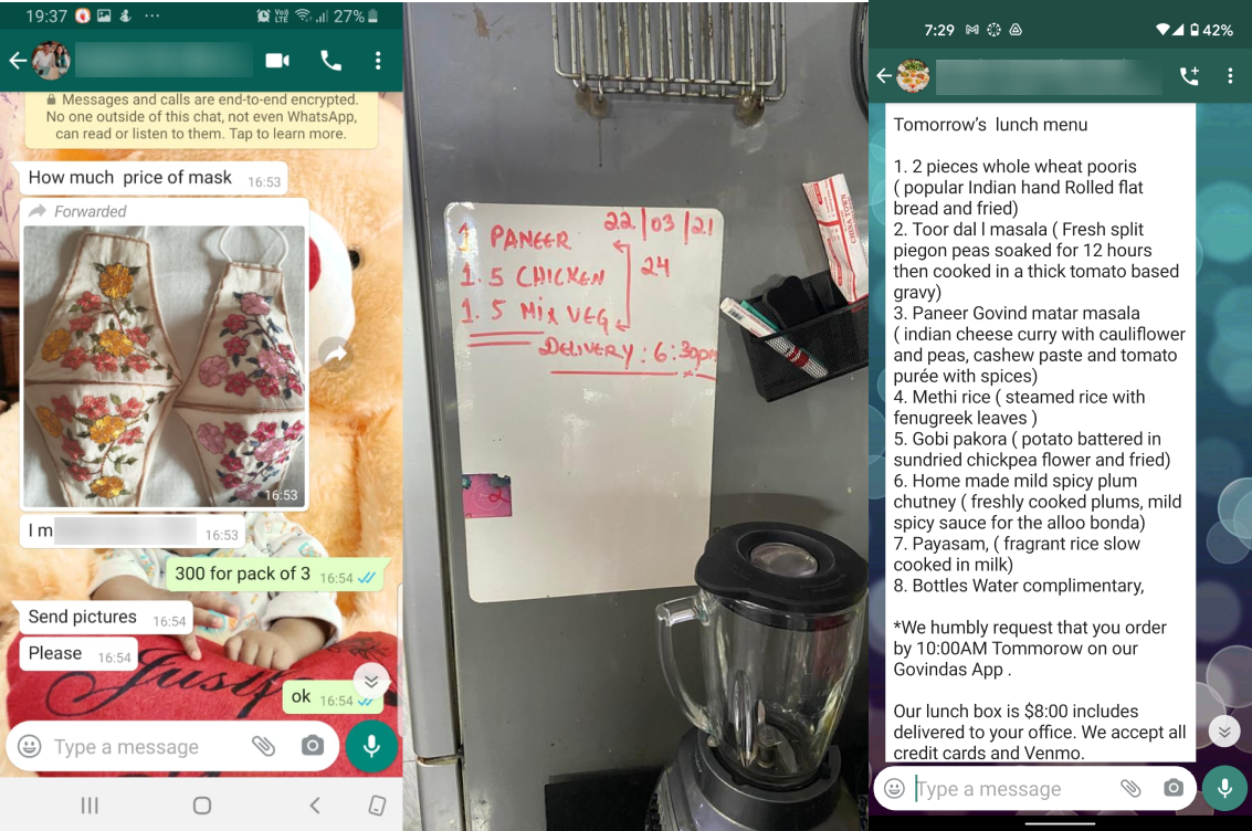
In the next section, you'll see how we organized the journey information, but these images really helped us understand what a WhatsApp catering interaction looks like and later how we could design interactions that would conform to how our users' expectations.
🗺️ Journey Mapping
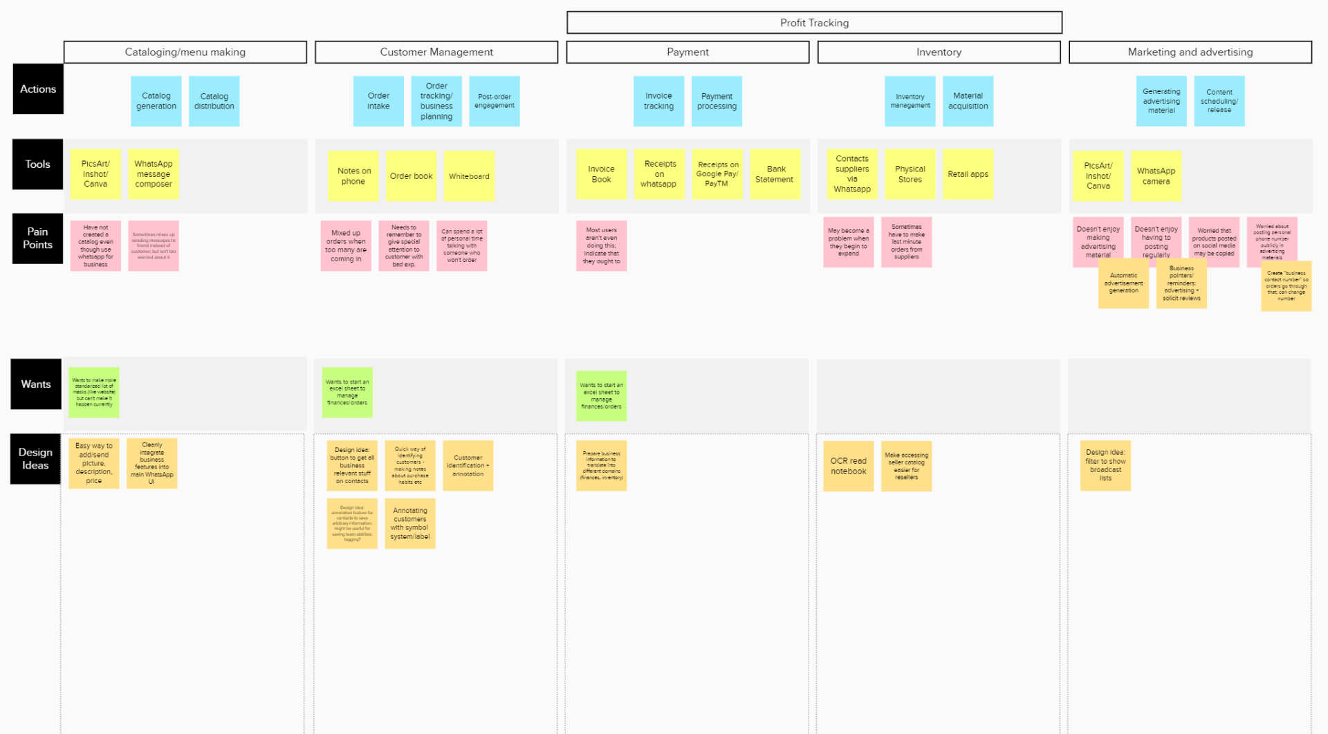
From those interviews, we constructed this journey map to better understand the process our users go through in running their business and identify areas where we could intervene.
Research Question #3
📋 Survey N=3
With our user journey mapped out, we wanted to present the pain points back to a wider population so they could rank which problems they felt were most salient. Thus, we created a ranking survey in Qualtrics and sent it out to our users and a few WhatsApp small business groups.
As you can tell by the meager population size, the survey did not circulate very effectively, so we ultimately had to rely on our assessment of the problems to proceed.
🎯 Problem Selection
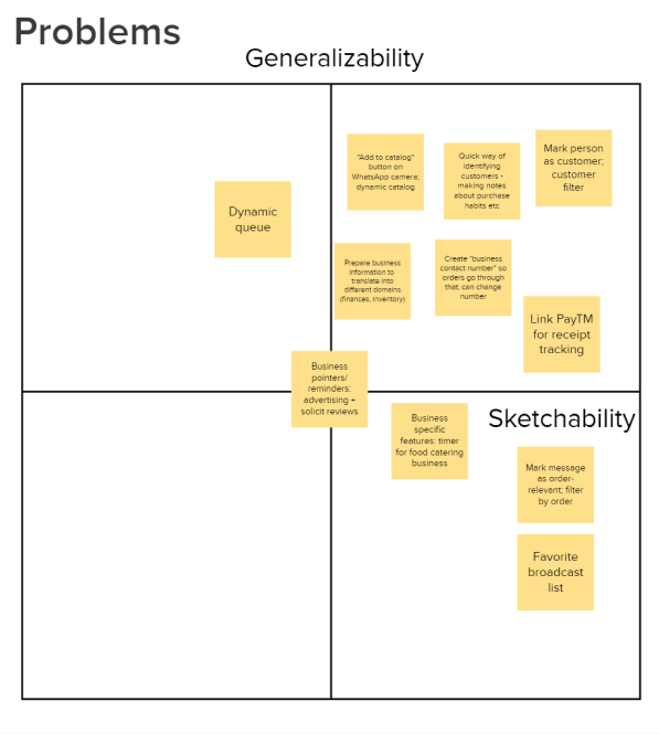
In lieu of user feedback, we constructed this problem selection activity which involved charting each problem we'd identified along axes of sketchability (how easily we could actually design the idea) and generalizability (how intensely, in our estimation given the data we had, the idea affected our population).
In the next section, I'll describe the winning ideas, and how we addressed them with design prototypes.
Design
We didn't have much time remaining in the semester to conduct a lengthy design process and we didn't want to skimp on an evaluation at the end, so we had to settle for an expedited design phase. This meant only creating wireframes; however, we did do our best to ensure that even as low-fidelity prototypes, they maintained the structure of WhatsApp.
🗒️ Problem 1: Disparate Business Information
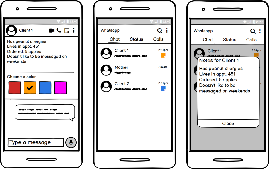
The first significant problem we identified was how often our users kept business-relevant information across a variety of touchpoints, from WhatsApp to other note-taking apps, to whiteboards and even physical notebooks.
We address this problem with contact annotation. Users can keep business pertinent information right in the contact Users can highlight contacts with colors, distinguishing business and personal contacts.
💬 Problem 2: Message Management
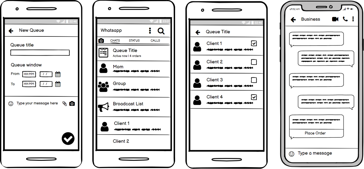
The second problem is that users can sometimes let customers fall through the cracks because business and personal messages are all mixed together.
With this idea, users can set time windows for orders, and have all those orders organized in a checklist, so they're not overburdened with
📰 Problem 3: Catalog Creation
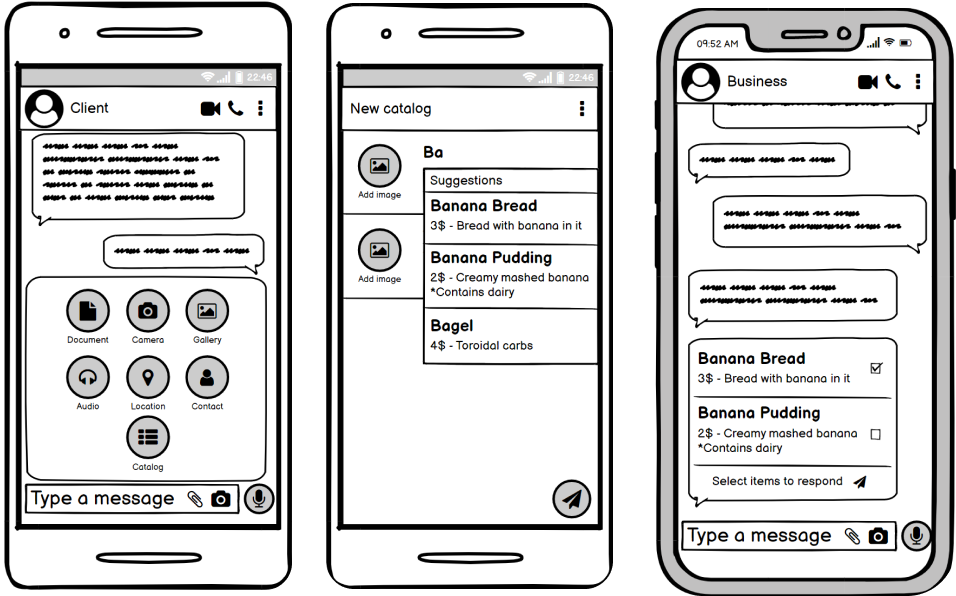
Finally, users spend a significant amount of time putting together catalogs and menus, often re-writing redundant items.
This concept lets users easily create and save catalogs with automatic suggestions from previous catalogs, and customers can now simply select items from a menu.
Evaluation
📋 Concept Testing N=4
Finally, we ran these concepts past several of our users to determine if they both understand our design ideas and can imagine actually using each design within a real life business context.
The protocol went as follows: we described concept verbally and asked users if they could imagine using it for their business. Then we walked through each wireframe and asked if the concept conformed to their expectations in practice. To negate order effects, the order of wireframes was randomized each session.
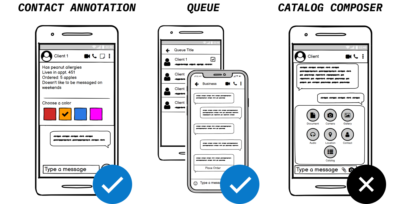
As you probably guessed given the beginning of this article, results showed that the first two concepts resonated with users, but not the catalog composer.
Participants felt that making the catalog wasn't all that difficult and they preferred having the option to make the catalog in their own style. However, while our design wasn't ideal, in the process of testing it, many participants mentioned that when they like making their own catalogs, they have to keep finding them in their phone to use as attachments. It's possible another design idea could more directly address this organizational issue.